Visualization plays a vital role in engaging customers or enhancing viewership. And, what adds to the potential of this visualization technique? There could be so many aspects to add in this list but colors are the one that remains on the top. Colors are not just limited to an artistic zone but should be an important business decision as well. Yes, you read that right! Your business website represents you and your offerings online. So, it must have the parts that affect everything from customers’ perceptions about a brand to what they think of your products when they scroll through your website. Thus, it is highly important to use the right color schemes and palettes to achieve your goals and be perceived by your target the way you want.
A study suggests that people make a subconscious judgment about the product within 90 seconds of initial viewing and 90% assessment is based on color alone.
There is a lot to take into consideration while designing a website like a layout, the planning, graphics or picking a suitable domain name, setting up the back-end, picking a theme, perfecting the content for your value proposition, and so on. And in all this, colors play an inevitable role. Color is an efficient way to grab the attention of your prospects and consumers while communicating them on an emotional or a subconscious level. There are particular colors that match your brand identity better whereas some are preferable for the background.
These colors are the ones that you can use to highlight the important information on your website. The primary colors will help you to call your viewers’ attention so you can guide them across your website. Use the primary color when you don’t your user to miss important things like:
Secondary colors for your website
Secondary or accent colors are more often used because you can employ them to highlight secondary information or to support content like a testimonial or more CTAs and other things like
Colors have a way to start building your brand in the mind of the consumer before using a single word or sentence. No color tells the same story to the customers so the most popular brand colors depend from industry to industry such as:
It conveys trustworthiness and dependability. The industries where consumer trust is vital and professionalism and reliability are key selling points, blue is often used as a primary branding color. It is not based on spontaneity or emotion but initiates a calm and logical decision-making process for industries like Banking, Airlines, Communications, Consumer finance, Hotels, Pharmaceuticals and so on.
This color conveys attention, hunger and passion. Industries that rely on emotions and impulsive decisions often use red as a primary color that is thought to stimulate hunger and is most common in the industries like Restaurants, Beverages, Food retail, Real-estate, Apparel.
Whatever the colors you will choose for your brand’s logo design would always indicate a symbol of your brand’s identity. It is like people would identify your site’s colors with your identity and it’s something you should devote some time to. To reach an absolute decision, you need to consider several aspects, do some color research and check how colors influence how others feel.
The truth about colors is that they have a lot to do in purchasing decisions and influence ours wants to buy things. Some colors have the ability to make us feel calm and safe while others provoke excitement and give us a sense of urgency. And that is how you can take complete advantage of colors in web designing. For instance, if you visit a website that employs colors you don’t like and colors that are not appealing, you won’t visit the site again. On the contrary, if you visit a web page or a landing page of a brand that makes you feel active, excited, you will probably end up buying a product from there.
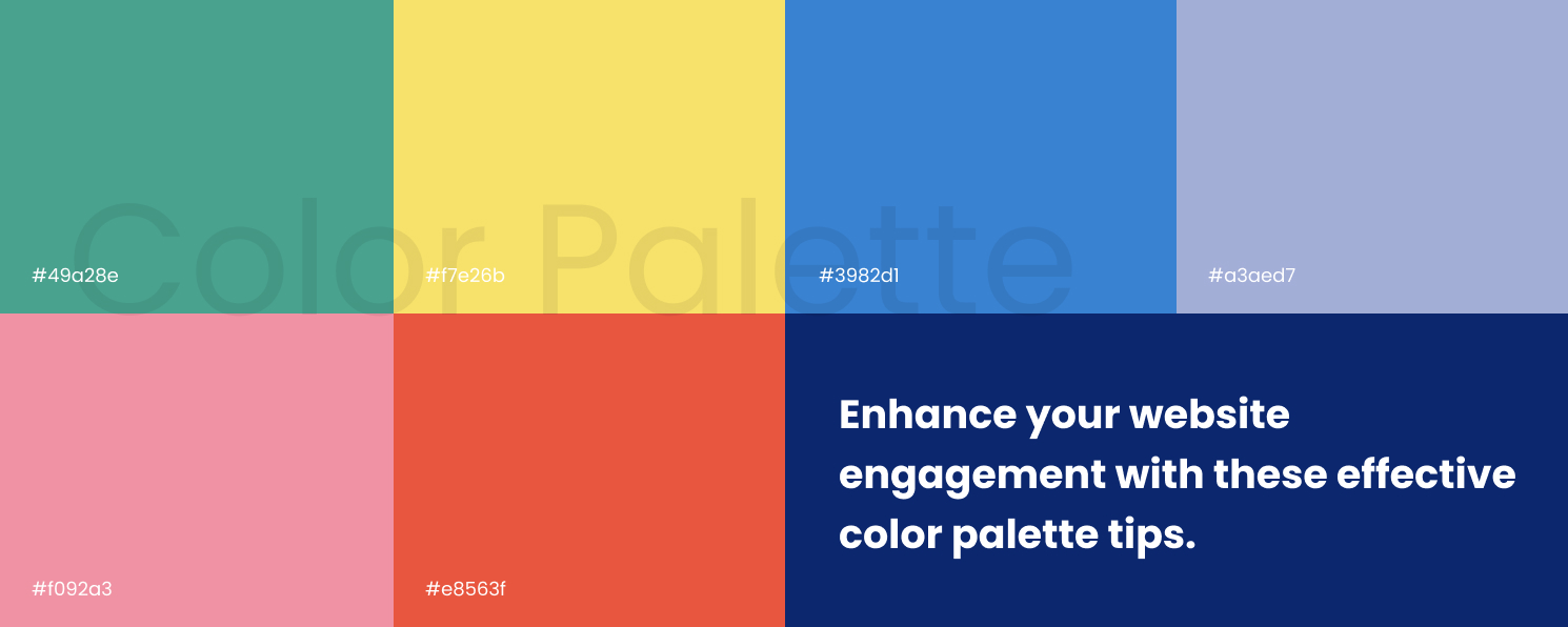
After considering the above aspects, here are some of the best website color palettes of 2020 for you to get an idea of which color scheme or contrast you can go with:
Have a look at these color generator tools mentioned below to create your color palette theme from scratch:
It comes up with decent color schemes. Moreover, it is a web and mobile-based app that helps you generate palettes from scratch. It has shade alternatives for each color option and other advanced tools that help you make efficient decisions about your color schemes.
You can add and drag around the selector on the color graph to find colors easily. Choose the type of palette you want whether adjacent colors, a triadic color scheme or others.
It generates color palettes based on a primary color that you put there and offers a wide variety of style options that give you more flexibility.
Summing up
There are always so many aspects when deciding on color themes on a website because your brand should not lag behind in today’s competitive era. So, it is crucial to think and act as per your brand requirement. You can always reach out to web designing services to get assistance in creating your website seamlessly and as per your requirements.

A seasoned technology writer and marketing consultant with over a decade of experience helping businesses grow online. I specialize in content marketing, SEO, web design, and e-commerce development. I am enthusiastic about using cutting-edge technology to acquire high-quality traffic, generate leads, and increase sales for my clients.