In today’s digital age, the importance of user experience can never be undermined, not when more and more searches are being performed on mobile phones and other hand-held devices as compared to desktop or laptops. The need for a mobile-friendly site these days has skyrocketed like never before which also plays a crucial role in a business’s overall success.
This has further led to the migration from the basic design to a more responsive one, the only change the retailers need to make in order to improve the customer journey and ultimately increase conversion rates. So, what does it mean to have a mobile-friendly site? Basically, becoming mobile-friendly means choosing a responsive web design over a dedicated mobile site.
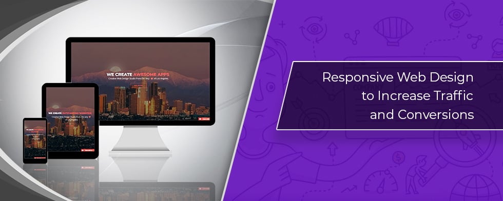
For those of you who do not know, a responsive web design is a development technique that aims at creating a website that can easily adjust itself to the size of the user’s screen. It will enhance the user’s browsing experience tenfold through flexible and responsive web pages that can fit into any device accessing it.
As we know, our web design strategy can have a huge impact on our site’s overall ability to rank in search engines also known as Search Engine Optimization or SEO. Therefore, the key here lies in developing a web design strategy keeping SEO in mind. What it basically means is ensuring that your web design doesn’t, in any way, have a negative impact on your site’s search rankings.
Often times in the past Google has hinted at building responsive sites that work fine on all the devices but in 2015, it started penalizing websites that were not responsive enough along with rewarding those that were created with a responsivity for search engine result pages. Not only this, Google also updated its algorithm that automatically makes mobile-friendly sites rank high in the SERPs. In other words, sites that are non-responsive will eventually see their rankings drop.
Moving on, let’s have a look at how upgrading your website to a mobile responsive design will help you reap the many rewards SEO has to offer.
This is a lesser known fact about responsive design that it was created to make social sharing easy especially for mobile users. Its also important to know that unlike social media that has a direct impact on SEO ranking, social sharing doesn’t so much in that aspect but it has something better it can easily help you grow an audience, which is another, more indirect way of increasing the search rankings.
Bounce rate is something that is related to spending time on a particular site, or to speak more frankly, how quickly the visitors leave the site or backtrack. Maybe it won’t matter to you but Google does keep a track of user behavior in relation to entry and exit point for a website and interpret these short dwellings as the information that you provided wasn’t relevant to the user’s needs. On the contrary, a responsive web design not only enables you to put relevant content but also display it in a mobile-friendly manner.
When it comes to spending a considerable amount of time on site (an offspring of improved user experience) or repeat customers or increased conversions, responsive design easily wins on all fronts. Thanks to its user-friendly design that makes reading and navigating the site that much easier. We have to understand here that the design elements of a website play a crucial role when it comes to providing a great customer experience which, in turn, is the result of positive reviews, traffic and a rise in branded searches.
This point is for those who have decided to follow down the path to a separate mobile site which may seem like a good option at the time. However, the problem comes when the Google crawl bots mark it as a duplicate content which almost always leads to lower rankings in search results. This happens because of the similar content on the desktop and mobile site even though the URL is different. But one doesn’t have to deal with duplicate content issues while using a responsive web design due to a single URL regardless of the device being used.
We all know how page loading times are an established and known factor. Therefore, every site should be optimized to load faster in order to rank it well in search engine results. And that’s why Google always recommend using mobile responsive sites. So, if your website is a responsive one, it will ordinarily load faster and, as a result, provide more positive user experience and a boost in conversions.
An important part of the user experience comes from the way you present your website to your visitors. So, if your website is, by any chance, unresponsive, outdated or just unsuited for mobile use, you are missing some great opportunities to convert visits into sales. And remember this, if you don’t provide a responsive website to your users, someone else will.

A seasoned technology writer and marketing consultant with over a decade of experience helping businesses grow online. I specialize in content marketing, SEO, web design, and e-commerce development. I am enthusiastic about using cutting-edge technology to acquire high-quality traffic, generate leads, and increase sales for my clients.