Investing a lot of time, money, and effort running your website can get disappointing when you get mediocre results in return. Maybe the surge of visitors you are expecting for is a mere trickle. Or maybe people are coming to your website only to leave without any action. So, what choice are you left with?
Well, you may try to find fault with your SEO, content, or marketing strategy, or may focus your attention on the bigger but often neglected issue; your site’s web design. Have you ever given it a thought how much web design mistakes can hurt your efforts?
From using hard-to-read fonts to blasting music on your homepage, there are a number of ways you can mess up your web design. And the thing is, you don’t even acknowledge these as a problem, you think of them merely as some ingenious ideas that seem pretty harmless.
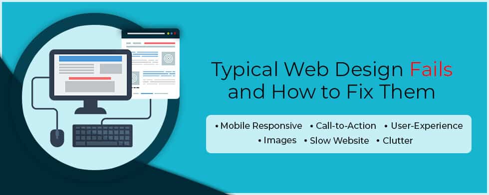
Little do you know these are the ones responsible for sending your visitors running to close their browsers. That’s why I have compiled here a list of frequently witnessed web design fails along with tips on how to fix them.
Majority of people these days use smartphones to access the web, which is why Google has rolled-out its mobile-first index. But if you don’t have a responsive mobile site, you can still index the desktop version but not without negatively impacting your search rankings.
You can fix this by using Google’s mobile-friendly test tool to analyze the page i.e. how the page looks to Google on a mobile device along with any mobile usability problems that it finds.
Even if you have the most visually appealing website but not an equally appealing Call to Action, we all know where this is heading. Without an obvious call to action, you will just confuse your visitors and end up losing sales.
Always place your CTA above the fold (the top area of the screen visible before you start scrolling) and try to provide a sample contact form using only the fields that are important.
Your site’s navigation should be such that can make it easy for users to find what they are looking for whether its a list of services, contact pages, staff bios or business hours- all within a few intuitive clicks.
For instance, make sure to place your contact info i.e. your phone number in a prominent place on every single page (generally the footer). In short, provide useful and accessible information to your users to avoid any miscommunication.
The best way to show colors on your website is through the use of pictures. Just remember, authenticity is the key here. And we will always recommend you to use your own shots over stock images.
Also, keep professionalism in mind while doing so. That means using snapshots taken from your grandma’s phone is a strict no-no. But that doesn’t mean you need to hire a photographer for the purpose, a good camera, and a few images taken from the right angle will do the job just fine.
We understand you love to have a lot of fancy JavaScript animations on your website along with the latest technology (and don’t forget gimmicks) but the thing is when it comes to performance, it won’t be of much use since the majority of people out there won’t wait for the whole site to finish downloading.
Here’s what you can do. Firstly, use the Lighthouse tool to identify and fix any load speed issues. Then you can try optimizing the images (compressing them to at least 200 kb), and thirdly, choose a web hosting provider with a track record of speed and quality.
Minimalism not only works in real life but digital life too. In the online world, the design of your website should be such as to provide focus, guidance, and a content hierarchy. Pop-ups, presentations etc. look great but overdo them and users might just decide it’s not worth the effort and leave it.
What you can do instead is to keep things simple. Instead of thinking what you can add, concentrate more on what you can remove. Other things you can do are leaving sufficient whitespace around design elements, staying consistent throughout, and divide topics in the form of sections, subpages etc.
So have you checked your website? Which web design mistakes are you guilty of? I am sure you must have found a few. If it is so, then what are your plans? Are you one of those DIY kind of guys who believe in doing everything yourself?
Or you are as clueless about web designing as the majority of us are. Because in such case, you can take the help of a web design company Los Angeles to help you out.
Why Los Angeles?
Just a whim!

A seasoned technology writer and marketing consultant with over a decade of experience helping businesses grow online. I specialize in content marketing, SEO, web design, and e-commerce development. I am enthusiastic about using cutting-edge technology to acquire high-quality traffic, generate leads, and increase sales for my clients.