PSD to Responsive HTML
W3C validated & Cross-Browser Compatible websites
PSD to Responsive HTML
Clap Creative offers pixel perfect PSD to Responsive HTML conversion services in Los Angeles at affordable prices and within a quick turnaround time. Our expert coders know how to maintain code structure intact during conversion along with search engine optimization elements.
Our clients experience high quality cross browser compatibility, W3C validation and semantic HTML that caters to their business goals. We guarantee pixel perfect coding and mobile device compatibility.
Clap Creative not only delivers an affordable PSD to responsive HTML but also keeps intact the performance features. We aim to save you not only save time and money but also better serve your customers. Our PSD to responsive website developers help you board the responsive website bandwagon safely.
2015 is shaping up to be an excellent year for responsive design. You might as well want responsive to be your core theme for web services. This might be taking things too far! However, developers are always on the lookout for efficient tools for responsive PSD to HTML5 conversion that saves them time and money. All over the internet, you will find dozens of tools and resources to help you with the switch. Here are some tools that will help your team make the transition smooth and successful.
Flat responsive design is all about user experience. Flat design has set trends for the past one year and is all over apps and web applications. In flat interface, icons are flat and more responsive compared to traditional senses. Also, flat design is better acceptable compared to blunt icons as noted in various researchers. It represents 3D objects in more real skeuomorphism terms.
Call our Los Angeles PSD to Responsive HTML developers today to discuss your project.
Our core values are at the heart of all that we do. They are integrated into our daily work lives and help us to remember our customers always comes first. Our previous clients rated us one of the greatest web design company in Los Angeles. We’re pleased to share their reviews.
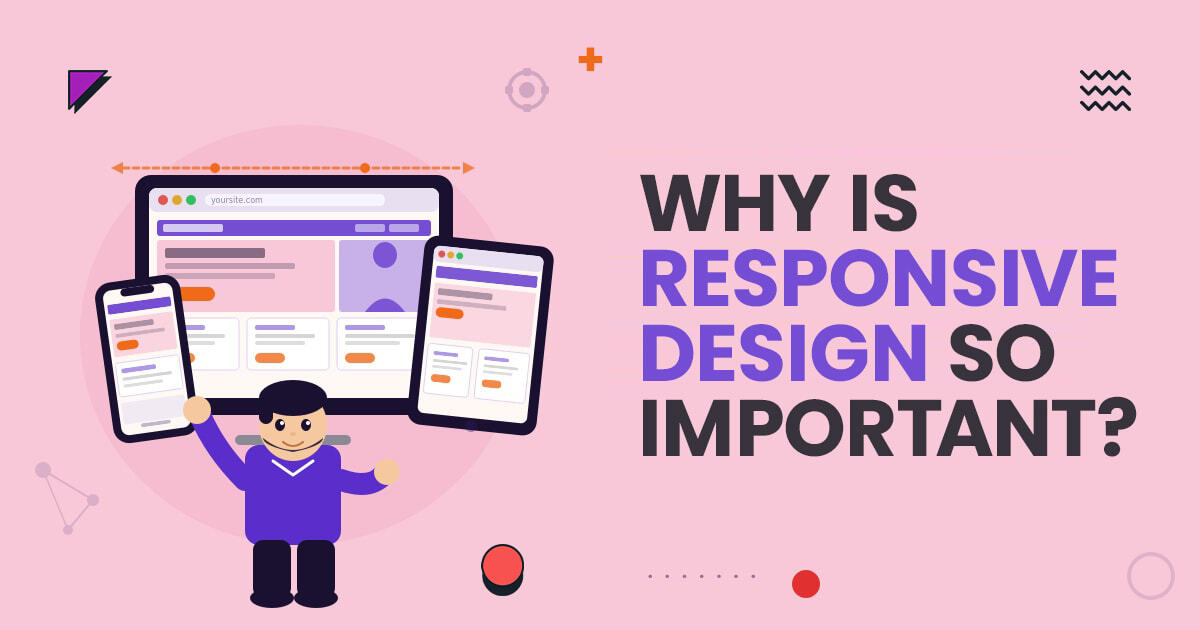
Your website is often the very first interaction people have with your business. Whether someone visits your site from a desktop computer, smartphone, tablet, or even a smart...
Choosing the right eCommerce platform is one of the biggest decisions for any online business. Your platform influences your website speed, customer experience, SEO performance, scalability, conversions, and...
Your website is often the first interaction potential customers have with your business. In a competitive market like Los Angeles, a generic website is no longer enough. Businesses...