Your website is often the very first interaction people have with your business. Whether someone visits your site from a desktop computer, smartphone, tablet, or even a smart TV, they expect a fast, smooth, and user-friendly experience.
If your website looks broken on mobile devices, loads slowly, or forces users to zoom and scroll endlessly, most visitors will leave within seconds. That means lost traffic, fewer leads, and missed business opportunities.
This is exactly why responsive design has become one of the most important parts of modern web development.
Responsive design ensures your website automatically adjusts to fit different screen sizes and devices, creating a consistent experience for every visitor. In today’s mobile-first digital world, having a responsive website is no longer optional — it’s essential.
In this blog, we’ll explain what responsive design is, why it matters, how it benefits your business, and why it plays a major role in SEO, user experience, and conversions.
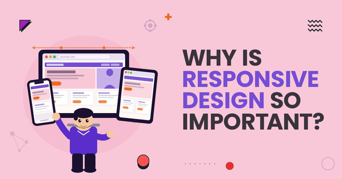
Responsive design is a web design approach that allows a website to automatically adapt its layout, content, images, and functionality based on the screen size of the device being used.
Instead of building separate desktop and mobile websites, responsive web design creates one flexible website that adjusts dynamically across all devices.
Whether someone visits your website using:
Your website should still look clean, organized, and easy to navigate.
Responsive websites use flexible grids, scalable images, and adaptive layouts to ensure users get the best possible browsing experience regardless of screen size.
The majority of internet users now browse websites on mobile devices. People use smartphones for everything from online shopping and booking appointments to reading blogs and searching for local businesses.
If your website is not optimized for mobile users, you risk losing a large portion of your audience.
Responsive design helps businesses:
Modern users expect websites to function perfectly across all devices. If your website feels outdated or difficult to use, visitors are likely to leave and choose a competitor instead.
User experience is one of the biggest reasons responsive design is so important.
Visitors should not have to:
A responsive website creates a smooth browsing experience by automatically adjusting layouts and content for different devices.
When users can easily navigate your website, they are more likely to:
Good user experience directly impacts customer satisfaction and conversion rates.
Responsive design plays a major role in search engine optimization.
Google prioritizes mobile-friendly websites because it wants to provide users with the best possible browsing experience. In fact, Google uses mobile-first indexing, meaning it primarily evaluates the mobile version of your website for ranking purposes.
A responsive website can help improve:
All of these factors contribute to stronger SEO performance.
If your website is difficult to use on mobile devices, your rankings may suffer, even if your content is strong.
That’s why responsive design is considered a critical part of modern SEO strategies.
Website speed matters more than ever.
Users expect websites to load quickly, especially on mobile devices. Slow-loading websites frustrate users and increase bounce rates.
Responsive design improves loading performance by:
Faster websites not only improve user experience but also help improve SEO rankings and conversion rates.
Even a few seconds of delay can significantly impact your traffic and sales.
Mobile traffic continues to dominate the internet.
If your website is not mobile-friendly, you may lose visitors before they even engage with your content.
Responsive websites make it easier for mobile users to:
As mobile usage continues growing, responsive design becomes even more important for business success.
A responsive website ensures you can effectively serve both desktop and mobile audiences without creating separate versions of your site.
Responsive design can directly impact your conversions and revenue.
When users have a positive browsing experience, they are more likely to take action.
This may include:
On the other hand, poor mobile experiences often cause visitors to leave before converting.
A responsive website removes friction from the customer journey and creates a more seamless path toward conversions.
Managing multiple versions of a website can become complicated and expensive.
Before responsive design became common, businesses often maintained separate desktop and mobile websites. This created extra work for:
Responsive design simplifies everything by allowing you to manage a single website across all devices.
This saves time, reduces maintenance costs, and ensures consistency throughout your website.
Your website reflects your business.
An outdated or broken mobile website can make your brand appear unprofessional and unreliable.
Responsive websites create a polished and modern appearance that helps build trust with visitors.
A clean, responsive design shows users that:
First impressions matter online, and responsive design helps create a positive one.
Technology constantly evolves.
New devices, screen sizes, and browsing behaviors continue emerging every year. Responsive design provides flexibility that helps your website adapt to future technologies more effectively.
Instead of rebuilding your website for every new device, responsive design allows your site to remain functional and visually appealing across changing platforms.
This makes responsive design a smart long-term investment for growing businesses.
Websites that are not responsive often struggle with:
Users today expect convenience. If your website creates frustration, visitors are unlikely to stay.
That’s why responsive design is now considered a standard requirement rather than an optional feature.
Absolutely.
Responsive design improves:
The long-term business benefits far outweigh the initial investment.
A responsive website helps businesses remain competitive in an increasingly mobile-driven online environment.
Responsive design is no longer just a design trend — it is an essential part of building a successful modern website.
As mobile traffic continues growing, businesses must ensure their websites provide fast, seamless, and user-friendly experiences across every device. Responsive web design helps improve SEO rankings, user engagement, website performance, and overall business growth.
Whether you run an ecommerce store, local business, service company, or corporate website, responsive design plays a critical role in your online success.
At Clap Creative, we create responsive websites that are built for performance, user experience, SEO, and conversions. Our team focuses on developing modern, scalable, and mobile-friendly websites that help businesses grow and stay competitive in today’s digital landscape.
Responsive web design is a design approach that allows websites to automatically adjust to different screen sizes and devices. It ensures users have a smooth browsing experience on desktops, tablets, and smartphones.
Responsive design improves mobile usability, page speed, and user experience, all of which are important Google ranking factors. Mobile-friendly websites generally perform better in search engine results.
Yes, responsive websites are typically optimized for better performance across devices. Faster loading speeds help improve user experience, reduce bounce rates, and increase conversions.
Absolutely. A responsive website makes it easier for users to navigate, read content, fill out forms, and complete purchases, leading to higher engagement and better conversion rates.
Yes, small businesses need responsive websites to compete online effectively. Many customers search for local businesses using mobile devices, so mobile optimization is essential for visibility and lead generation.
Non-responsive websites often create poor user experiences, higher bounce rates, lower search rankings, and reduced conversions. Visitors may leave the site if it is difficult to use on mobile devices.

A seasoned technology writer and marketing consultant with over a decade of experience helping businesses grow online. I specialize in content marketing, SEO, web design, and e-commerce development. I am enthusiastic about using cutting-edge technology to acquire high-quality traffic, generate leads, and increase sales for my clients.