Posts Tagged ‘Responsive Web Design’

Typical Web Design Fails and How to Fix Them

February 15th, 2019

Investing a lot of time, money, and effort running your website can get disappointing when you get mediocre results in return. Maybe the surge of visitors you are expecting for is a mere trickle. Or maybe people are coming to your website only to leave without any action. So, what choice are you left with?

Well, you may try to find fault with your SEO, content, or marketing strategy, or may focus your attention on the bigger but often neglected issue; your site’s web design. Have you ever given it a thought how much web design mistakes can hurt your efforts?

From using hard-to-read fonts to blasting music on your homepage, there are a number of ways you can mess up your web design. And the thing is, you don’t even acknowledge these as a problem, you think of them merely as some ingenious ideas that seem pretty harmless.

Little do you know these are the ones responsible for sending your visitors running to close their browsers. That’s why I have compiled here a list of frequently witnessed web design fails along with tips on how to fix them.
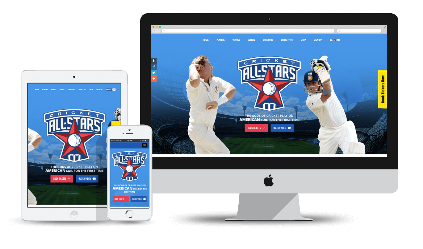
Mobile Responsive

Majority of people these days use smartphones to access the web, which is why Google has rolled-out its mobile-first index. But if you don’t have a responsive mobile site, you can still index the desktop version but not without negatively impacting your search rankings.

You can fix this by using Google’s mobile-friendly test tool to analyze the page i.e. how the page looks to Google on a mobile device along with any mobile usability problems that it finds.

Call-to-Action

Even if you have the most visually appealing website but not an equally appealing Call to Action, we all know where this is heading. Without an obvious call to action, you will just confuse your visitors and end up losing sales.

Always place your CTA above the fold (the top area of the screen visible before you start scrolling) and try to provide a sample contact form using only the fields that are important.

User-Experience

Your site’s navigation should be such that can make it easy for users to find what they are looking for whether its a list of services, contact pages, staff bios or business hours- all within a few intuitive clicks.

For instance, make sure to place your contact info i.e. your phone number in a prominent place on every single page (generally the footer). In short, provide useful and accessible information to your users to avoid any miscommunication.

Images

The best way to show colors on your website is through the use of pictures. Just remember, authenticity is the key here. And we will always recommend you to use your own shots over stock images.

Also, keep professionalism in mind while doing so. That means using snapshots taken from your grandma’s phone is a strict no-no. But that doesn’t mean you need to hire a photographer for the purpose, a good camera, and a few images taken from the right angle will do the job just fine.

Slow Website

We understand you love to have a lot of fancy JavaScript animations on your website along with the latest technology (and don’t forget gimmicks) but the thing is when it comes to performance, it won’t be of much use since the majority of people out there won’t wait for the whole site to finish downloading.

Here’s what you can do. Firstly, use the Lighthouse tool to identify and fix any load speed issues. Then you can try optimizing the images (compressing them to at least 200 kb), and thirdly, choose a web hosting provider with a track record of speed and quality.

Clutter

Minimalism not only works in real life but digital life too. In the online world, the design of your website should be such as to provide focus, guidance, and a content hierarchy. Pop-ups, presentations etc. look great but overdo them and users might just decide it’s not worth the effort and leave it.

What you can do instead is to keep things simple. Instead of thinking what you can add, concentrate more on what you can remove. Other things you can do are leaving sufficient whitespace around design elements, staying consistent throughout, and divide topics in the form of sections, subpages etc.

Parting Thoughts

So have you checked your website? Which web design mistakes are you guilty of? I am sure you must have found a few. If it is so, then what are your plans? Are you one of those DIY kind of guys who believe in doing everything yourself?

Or you are as clueless about web designing as the majority of us are. Because in such case, you can take the help of a web design company Los Angeles to help you out.

Why Los Angeles?

Just a whim!

Everything You Need to Know About AMP (Accelerated Mobile Pages)

June 29th, 2018

Often times you come across a symbol just beside your search results whenever you run a cursory search on your mobile phone. Ever wondered what that is or should your site even have it? Well, that my friend is an AMP or Accelerated Mobile Pages.

What is AMP?

For those of you who are unfamiliar, AMP is an open-source project from Google that helps facilitate the creation of really fast-loading mobile pages. Though this program was initiated by Google, it is not owned by Google but share a wide range of supporters such as Bing, Pinterest, Twitter etc.

How AMP works?

AMP usually works by stripping away a large portion of the webpage’s original content (that is being searched by the user) in order to optimize the page for mobile viewing. As a result, there is literally no time gap between jumping from the search page to the webpage. It is because of these similarities in the working process that some even claim that AMP is a direct response to Facebook’s instant articles from Google for providing its followers a platform to read articles quickly without leaving the Facebook page.

What can AMP do for your business?

Have you ever tried loading your site on mobile? What a silly question, of course, you have but are you really happy with the loading speed? My guess is, you aren’t. And why would you? Loading a site on desktop takes an ample amount of time even with a fast internet connection but loading a site in mobile on simple data plans? I know, it drives me crazy too.

Benefits:

So, now you know why AMP is important for your business website, still not sure? Maybe this will help you convince.

  • It’s super-fast, though it may force you to delete certain codes along with implementing some specific development practices to help you achieve that speed.
  • We all know how the speed of a site helps in determining the ranking factor, so if your pages are AMP-lified, they have a much better chance of ranking higher in Google mobile search results. It will go a long way in improving the SEO efforts of a website.
  • If your site loads faster than the competitors’, visitors are more likely to come often to your site along with prolonging their stays and leaving you with a better chance to make the sale.
  • Even the major non-Google sites such as Bing, twitter etc. are starting to show AMP version of pages in their search results whenever available.

Drawbacks:

Since we are talking about AMPs in general, it would be wrong to mention only its benefits without referring to its drawbacks, however few they may be.

  • AMP projects support ads too though it is not at all advisable to implement ads on AMP run pages as it will severely limit the potential to bring in revenue.
  • AMP also supports Google Analytics but implementing it on AMP run pages requires a different tag which, in turn, takes a lot of time to collect and analyze data.

AMP-lifying your website will require you to develop a new mobile theme for that site, if not, at least make your existing theme AMP-compatible.

There’s another major drawback to integrating an AMP strategy, as you know it requires you to strip down the HTML, further affecting the styling and the webmaster’s ability to incorporate branding into the web pages and as a result, can make your AMP pages look ugly, I mean really ugly.

But the important thing is, if you possess the time and resources to properly implement AMP strategy (including setting up attribution and customizing it correctly), then there is simply no reason left not to go on with it.

What to expect from AMP in 2018?

As we move further into 2018, Google too has been slowly and steadily furthering and expanding the reach of AMP. Where earlier, it was only restricted to recipe articles, news, how-to content, posts etc., nowadays, apart from superfast loading speed, lighter and faster versions of ads are available (all thanks to the integration of AMP into ad formats). But that’s not all, let’s see what 2018 has brought for us-

  1. Google has integrated ‘AMP stories’ (fancy way of storytelling keeping mobile in mind) into SERP (Search Engine Result Pages).
  2. Now, traffic from AMP pages can be displayed as ‘organic search traffic’ in analytics tool, rather than referral traffic, as in past.
  3. As I mentioned earlier, AMP pages, though fast, were often ugly looking but with the help of new customization options and some added functionality, pages look a lot better.
  4. Google is also working on displaying publisher’s URL instead of Google’s URL in the search results.
  5. Google has also introduced AMP framework for email which will be available to all users by the end of this year.

Closing Thoughts:

Ok, that was everything you need to know about AMP and whether or not its suitable for your site. But remember what I said earlier, if you have the time and resources, then there’s simply no reason left not to do it. Also, it may not be around forever but as long as it is, it only makes perfect sense to reap the benefits it has to offer while you still can.

Responsive Web Design to Increase Traffic and Conversions

June 16th, 2018

In today’s digital age, the importance of user experience can never be undermined, not when more and more searches are being performed on mobile phones and other hand-held devices as compared to desktop or laptops. The need for a mobile-friendly site these days has skyrocketed like never before which also plays a crucial role in a business’s overall success.

This has further led to the migration from the basic design to a more responsive one, the only change the retailers need to make in order to improve the customer journey and ultimately increase conversion rates. So, what does it mean to have a mobile-friendly site? Basically, becoming mobile-friendly means choosing a responsive web design over a dedicated mobile site.

What is a responsive web design?

For those of you who do not know, a responsive web design is a development technique that aims at creating a website that can easily adjust itself to the size of the user’s screen. It will enhance the user’s browsing experience tenfold through flexible and responsive web pages that can fit into any device accessing it.

What is the strategy behind a responsive web design?

As we know, our web design strategy can have a huge impact on our site’s overall ability to rank in search engines also known as Search Engine Optimization or SEO. Therefore, the key here lies in developing a web design strategy keeping SEO in mind. What it basically means is ensuring that your web design doesn’t, in any way, have a negative impact on your site’s search rankings.

What are Google’s thoughts on responsive design?

Often times in the past Google has hinted at building responsive sites that work fine on all the devices but in 2015, it started penalizing websites that were not responsive enough along with rewarding those that were created with a responsivity for search engine result pages. Not only this, Google also updated its algorithm that automatically makes mobile-friendly sites rank high in the SERPs. In other words, sites that are non-responsive will eventually see their rankings drop.

Moving on, let’s have a look at how upgrading your website to a mobile responsive design will help you reap the many rewards SEO has to offer.

How can responsive web design help increase traffic and conversions?

  • Encourage Social Sharing

This is a lesser known fact about responsive design that it was created to make social sharing easy especially for mobile users. Its also important to know that unlike social media that has a direct impact on SEO ranking, social sharing doesn’t so much in that aspect but it has something better it can easily help you grow an audience, which is another, more indirect way of increasing the search rankings.

  • Lowering Bounce Rate

Bounce rate is something that is related to spending time on a particular site, or to speak more frankly, how quickly the visitors leave the site or backtrack. Maybe it won’t matter to you but Google does keep a track of user behavior in relation to entry and exit point for a website and interpret these short dwellings as the information that you provided wasn’t relevant to the user’s needs. On the contrary, a responsive web design not only enables you to put relevant content but also display it in a mobile-friendly manner.

  • Offering Better UX

When it comes to spending a considerable amount of time on site (an offspring of improved user experience) or repeat customers or increased conversions, responsive design easily wins on all fronts. Thanks to its user-friendly design that makes reading and navigating the site that much easier. We have to understand here that the design elements of a website play a crucial role when it comes to providing a great customer experience which, in turn, is the result of positive reviews, traffic and a rise in branded searches.

  • Fighting Off Piracy

This point is for those who have decided to follow down the path to a separate mobile site which may seem like a good option at the time. However, the problem comes when the Google crawl bots mark it as a duplicate content which almost always leads to lower rankings in search results. This happens because of the similar content on the desktop and mobile site even though the URL is different. But one doesn’t have to deal with duplicate content issues while using a responsive web design due to a single URL regardless of the device being used.

  • Reduced Downloading Time

We all know how page loading times are an established and known factor. Therefore, every site should be optimized to load faster in order to rank it well in search engine results. And that’s why Google always recommend using mobile responsive sites. So, if your website is a responsive one, it will ordinarily load faster and, as a result, provide more positive user experience and a boost in conversions.

Summing Up:

An important part of the user experience comes from the way you present your website to your visitors. So, if your website is, by any chance, unresponsive, outdated or just unsuited for mobile use, you are missing some great opportunities to convert visits into sales. And remember this, if you don’t provide a responsive website to your users, someone else will.

Cricket All Stars 2015 – One of our best pieces of work!

October 14th, 2015

At Clap Creative, our designers and developers are always committed to delivering world-class website designs along with cutting-edge web applications. So far, we have created various amazing websites, exceeding our clients’ expectations.

Another feather in our cap is the cricket All Stars website and we have just fallen in love with this website. It’s not just because we are hardcore cricket fans, but there are amazing features integrated into the website, making it our best portfolio website of 2015.

And Its Best for a Reason

First of all, we are really proud to say that our client, Leverage Agency, were really impressed with our work. And for good reason! Cricket All Stars is a tremendous showcase of the new web dynamics, be it designing, ticketing, responsive site to name a few. It allows people to book their tickets online for the upcoming cricket series in the United States. This site is developed on Bootstrap 3, PHP and the shop (upcoming) is based on Magento and provides utmost convenience to the people who are die-hard cricket fans.

Cricket All Stars 2015 - Sachin Blasters V/s Warne Warriors - ClapCreative


Fast, Feature Rich and Intuitive – That’s Cricket All Stars for You!

We make sure our websites have fast loading time so that the users don’t switch to other websites. All the icons, content and graphics are clear and understandable to make the perfect first impression. Navigations are clear and accessible. All the necessary details are mentioned on the homepage, including the teams playing, player information, venues, timing, and everything one is looking for.

If you want to get more information about the players, you just need to click on the picture of your favorite player and there you get a sneak peek into the life of your idol. Also, there is a yellow color icon placed ‘Book Tickets Now‘ that allows the user to book the tickets with just a few clicks. The website is completely responsive so it looks good on each and every screen in the world. There is a signup form at the bottom, users can either sign up through their emails or through social networking websites such as Facebook and Twitter, etc. With these features, we just aim to provide a wonderful experience to the users.

Get Immersive Cricketing Experience

Twitter Wall of Cricket All Stars 2015 - Sachin Blasters V/s Warne Warriors - ClapCreative

We understand that people are always eager to know about what their favorite cricketers are up to. That’s why we have added a section where users can read the latest tweets of the players. This can be called a ‘cricket encyclopedia’, since we have made every best effort to add all the necessary features and icons that can help people stay up-to-date about the latest cricket events.

For newbies, we have added a section Cricket 101, where all the relevant and necessary information about cricket techniques are mentioned. Facebook, Twitter and Email icons are placed on the right side so that people can share the videos, tweets or any other information with their friends.

In short, it is a fully functional, accessible, interactive, search-engine friendly website with flexible grids and creative styling. Just visit the website and feel the difference.
So, you see, we have a great contender for our ‘Best Website in Our Portfolio 2015’.