Posts Tagged ‘web design’

What is the Impact of IoT on Web Designing in This New Age?

June 7th, 2019

With the revolution of human interaction with technology and the internet, those everyday objects in our house that have in connection with the internet, bringing valuable changes to human lives. It is IoT (Internet of Things) that is forming a bond between real and virtual life to experience technology more realistic.

But out of daily routines, if we talk about websites, how the IoT leave an impact over designing of these online sites. First of all, let’s see what is the website designing in these days:

A Complex Task to Undertake:

Website designing becomes a little bit complex in these days. A designer needs to present clean front-end interfaces that can easily communicate with different devices across the tech world. If the design is more flexible, it is easy to adopt by the array of devices that can be connected via IoT.

Strong Framework is What All Needed:

Frameworks that include back-end databases need to be strong so that data acquired from different gadgets corresponding to every user will have to kept securely and accessed according to the wants. For this, knowledge of top frameworks will add extra butter in popcorn basket.

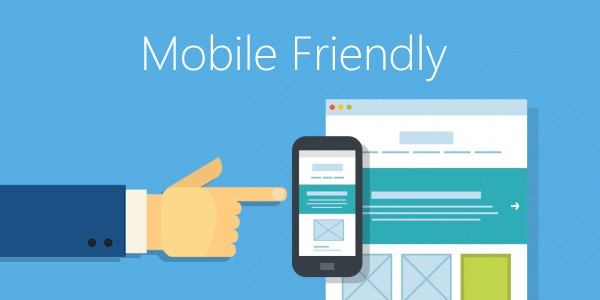
Mobile User Experience is the Key:

User experience is the essential part and mobile-only interfaces are becoming more popular with increasing usage of smartphones. Simple designs are the best for these tiny devices as they are easy to load. Hence, important features of user experience designs and aid in personalization preferred to be put in it.

Loading Speed Play a Decisive Role:

The loading speed of the design pages plays a crucial role. There will be a communicating leg between an IoT device and a web server. When it comes to design, it is better to implement the one that you generally prefer for slow designs.

Security is Main Concern:

One of the drawbacks of IoT is that it is endangered to attacks by hackers. If there are no essential security measures taken to protect your design connected with IoT, an attack can happen at any time from anywhere. And they can access the contents which sound scary. The most important point to keep in mind when integrating web design with IoT is that there is no loophole left out for a potential hacker to attack.

Power Management is to Keep in Mind:

When we talk about IoT devices, an obvious fact strikes to mind i.e., Mobile, Laptops, Tablets and other battery-powered instruments. This requires full-fledged power management for them. It is common that when heavy programs run in the backend drain the massive battery which causes less user communication. So, the new layout should be designed to minimize excess power usage.

So, How IoT Effects Web Designing?

IoT is that smart technology that connects the smart devices and helps them to operate flawlessly. We all have had a chance to experience the IoT and its awesomeness at a particular point of time. Businesses have already started using certain specific technologies to help them track users, their behavior and patterns that go through the user journey when they land on a site as a visitor and later turn into a customer.

Personalized and unique service is what all users prefer at all times, and this is where an IoT device plays an important role in providing users with a customized experience. Web designers should have knowledge of creating well-managed and sophisticated web designs that are able to respond to users personalized data and can easily be integrated with web-enabled devices.

Conclusion:

The IoT and its connection to web design have a long way to go and we can expect miracles to unveil over the years to come. Already people have started experiencing the advantages of these integrations and implementation of IoT devices, as these are making their lives simple and easy.

Typical Web Design Fails and How to Fix Them

February 15th, 2019

Investing a lot of time, money, and effort running your website can get disappointing when you get mediocre results in return. Maybe the surge of visitors you are expecting for is a mere trickle. Or maybe people are coming to your website only to leave without any action. So, what choice are you left with?

Well, you may try to find fault with your SEO, content, or marketing strategy, or may focus your attention on the bigger but often neglected issue; your site’s web design. Have you ever given it a thought how much web design mistakes can hurt your efforts?

From using hard-to-read fonts to blasting music on your homepage, there are a number of ways you can mess up your web design. And the thing is, you don’t even acknowledge these as a problem, you think of them merely as some ingenious ideas that seem pretty harmless.

Little do you know these are the ones responsible for sending your visitors running to close their browsers. That’s why I have compiled here a list of frequently witnessed web design fails along with tips on how to fix them.

Mobile Responsive

Majority of people these days use smartphones to access the web, which is why Google has rolled-out its mobile-first index. But if you don’t have a responsive mobile site, you can still index the desktop version but not without negatively impacting your search rankings.

You can fix this by using Google’s mobile-friendly test tool to analyze the page i.e. how the page looks to Google on a mobile device along with any mobile usability problems that it finds.

Call-to-Action

Even if you have the most visually appealing website but not an equally appealing Call to Action, we all know where this is heading. Without an obvious call to action, you will just confuse your visitors and end up losing sales.

Always place your CTA above the fold (the top area of the screen visible before you start scrolling) and try to provide a sample contact form using only the fields that are important.

User-Experience

Your site’s navigation should be such that can make it easy for users to find what they are looking for whether its a list of services, contact pages, staff bios or business hours- all within a few intuitive clicks.

For instance, make sure to place your contact info i.e. your phone number in a prominent place on every single page (generally the footer). In short, provide useful and accessible information to your users to avoid any miscommunication.

Images

The best way to show colors on your website is through the use of pictures. Just remember, authenticity is the key here. And we will always recommend you to use your own shots over stock images.

Also, keep professionalism in mind while doing so. That means using snapshots taken from your grandma’s phone is a strict no-no. But that doesn’t mean you need to hire a photographer for the purpose, a good camera, and a few images taken from the right angle will do the job just fine.

Slow Website

We understand you love to have a lot of fancy JavaScript animations on your website along with the latest technology (and don’t forget gimmicks) but the thing is when it comes to performance, it won’t be of much use since the majority of people out there won’t wait for the whole site to finish downloading.

Here’s what you can do. Firstly, use the Lighthouse tool to identify and fix any load speed issues. Then you can try optimizing the images (compressing them to at least 200 kb), and thirdly, choose a web hosting provider with a track record of speed and quality.

Clutter

Minimalism not only works in real life but digital life too. In the online world, the design of your website should be such as to provide focus, guidance, and a content hierarchy. Pop-ups, presentations etc. look great but overdo them and users might just decide it’s not worth the effort and leave it.

What you can do instead is to keep things simple. Instead of thinking what you can add, concentrate more on what you can remove. Other things you can do are leaving sufficient whitespace around design elements, staying consistent throughout, and divide topics in the form of sections, subpages etc.

Parting Thoughts

So have you checked your website? Which web design mistakes are you guilty of? I am sure you must have found a few. If it is so, then what are your plans? Are you one of those DIY kind of guys who believe in doing everything yourself?

Or you are as clueless about web designing as the majority of us are. Because in such case, you can take the help of a web design company Los Angeles to help you out.

Why Los Angeles?

Just a whim!

7 Reasons Why Pageless Design is the Future of Web Designing

April 4th, 2018

Earlier, when websites were invented, basic HTML pages were enough to bring in quality traffic. Those were the days when websites were composed of several pages containing tons of information. These pages were further subdivided into several more pages, breaking the information into smaller bits that could be accessed from the navigation menu.

However, with the evolution of technology came mobile phones which replaced desktops and became our prime source of web browsing. But this shifting lead to another sort of problem, smaller screens, and completely different navigation system. Not only this, there were still many who still preferred good old desktops way more than smartphones.

Now, this called for a complete overhaul of traditional website’s modus operandi. The result? Pageless web design- a product of minimalism.

What is a Pageless Web Design?

Pageless web design is basically a step towards freeing traditional websites from the outdated conventions of print design distributed through several pages and presenting all the required information on a single page layout thus making your browsing experience a contemporary and enjoyable one.

Why is Pageless Design the future of Web Design?

I will give you not one or two but seven reasons as to why pageless web design is far more superior to conventional web design and why you should consider having it.

  1. The Responsive Design that Looks Great on all Devices

Pageless websites are immensely popular for their responsiveness and can go native on all devices be it featured phones, smartphones, tablets, laptops, desktops etc. By creating a uniformity across platforms for features like interaction, scrolling and navigation, pageless web designs are far ahead than their conventional counterparts when it comes to creating user-friendly experiences.

  1. A Well-Organised Content instead of a Scattered One

Most conventional sites present today with its huge quantity of texts, a distracting slider image, links and icons spread through several pages and God knows what else give the look of a scattered and messy website. Whereas with a pageless site, the structured narrative is presented on a single page which gives you the ability to control the content and present it in whichever way you want the information to be available to your audience.

  1. Much More Affordable than Conventional Websites

Creating a beautiful, custom website has always been an expensive endeavor for individuals and businesses alike. But not anymore, the best thing about pageless designs is that they are not expensive at all since they don’t involve any complexity and the production of individual pages. At an average, pageless sites cost just 30% of what you pay for a custom designed website.

  1. Helps in Decreasing Bounce Rates

It’s a commonly known that pageless websites have much lower bounce rates as compared to the conventional ones. The reason lies in the fact that single page sites make it relatively easier for users to find the desired information in a short period of time. This results in the generation of new leads, easy promotion of products and services, and the overall increase in the sales. Isn’t this what we all want?

  1. Iterative Process that Greatly Improves the User Experience

Iteration is a cyclic process that lets you make easy, fast and effective changes based on analytics and user feedback on your website’s layout. Since a pageless site contains only a single page to be put up, updating it is a piece of cake.

  1. Let’s You tell Captivating Stories to Your Audience

The primary objective of building websites has always been to tell their compelling stories to the existing and prospective audiences. It’s your choice how you want this story to be presented, either by creating a website on one page following a storyline, without any distractions or by scattering the bits over sub-categories divided over multiple pages.

  1. Allow Visitors to Easily Share these Stories

Have you ever tried sharing an entire standard website with someone? Of course not, because it’s simply not possible. The best you can do is zero in on the small bits and share that portion with the other person. But sharing a pageless site is not only possible (thanks to the single page web design) but is a butter-smooth process as well. Now you can easily present all that compelling information to your audience within no time.

Conclusion:

Apart from all the above-mentioned reasons, Search Engine Optimization is another important factor that cannot be ignored. And this is where you will receive the biggest benefit your pageless website has to offer. With the help of your one full proof and self-explanatory branded website, your SEO rankings will improve significantly as apart from increased social sharing and conversion rates, Google PageRank score will also be applied to your overall site as well.

Things to Consider Before You Launch Your Website

March 22nd, 2018

Launching a brand new website, redesigning an existing one via Web Design Company or moving a site onto a new CMS (Content Management System) for a client is all about a staggering number of small ways to not screw up. It also includes managing many moving parts as well such as content, design, marketing, and the technical side. To make sure you miss out on nothing, here are a few things to consider if you wish to make your website launch a success. First of all, you should,

Figure Out the Launch Schedule

It includes everything from setting a launch date (which should at least be a month prior to give you enough time for research, design and development) to preparing for worst-case scenarios (prepare a list of ‘what could go wrong’ and device a backup plan) to setting up a staging site (to edit and work with updates in an identical environment).

Now that you have a month before your big day, let’s check out some other issues you might face and how to avoid them.

  1. Check Content

Let’s start with content, after all, content is king. Here’s what you have to look out for-

  • Grammar and Spelling which includes capitalization, tense/style of writing, variations in words, recurring phrases etc.
  • Typography and Layout which includes checking for punctuation marks, headings and orphan terms in important paragraphs.
  • Test Content should not be present anywhere on site, check it out and trash it wherever you find it.
  • Proof Read which includes reading everything, again and again, to pick out anything you missed (A tip: get others to read as well).
  1. Check SEO

SEO or Search Engine Optimization means to analyze and optimize your website to ensure a high ranking. Here’s what you can do-

  • Use Proper Meta SEO Tags to help web crawlers (which read your website to understand content in order to help search engines display your website on appropriate places) understand your site by tilting and describing your pages. Here you have to focus on –

       a) Meta Title which translates to the linked text that appears on search results (use relevant keywords)

       b) Meta Description is a short sentence which describes what your website offers (keep character limit under 160).

  • Use Proper Semantic Structure to help web crawlers such as Google bots to crawl over your site. The key here is to use traditional (such as h1-h6 for heading, p for paragraphs and ul/ol for unordered and ordered tags) as well as new HTML5 semantic tags (such as <header>, <footer> etc) in your language to help them better understand.
  • Open Graph Setting includes three pieces of content namely title, description and an image where the title and description follow the same rules as their SEO counterparts but with one major difference, they appear on social media platforms when shared. Same goes for images too.
  1. Check Design

Web design plays a crucial role in the production and maintenance of websites. The things you should checkout are-

  • 404 Page is the most commonly overlooked defensive design element. Make sure to set up a custom 404 page on your website to direct your users to the home page or any other page they may be interested in.
  • Mobile Device Testing is essential as it ensures your site’s proper working on multiple screen sizes. You can check this by going to Page Audit module in Website Auditor and look through the page usability information (A tip: implement AMP to load faster on mobile devices).
  • Scan Site Speed regularly to serve content quickly to your users as your page load speed will directly affect the overall website’s Google ranking. A few ways to fix page load speed include –

a) Opt for a faster hosting solution.

b) Enable compression to reduce bandwidth by zipping large files.

c) Minify HTML/JavaScript/CSS

d) Store media files on a CDN (Content Delivery Network)

Checking live URLs and Links manually to make sure they work alright is manageable provided you have a small business website with a few pages but if you own a large commercial website, then the URL check should be automated (A tip: use WebSite Auditor tool to scan and resolve URL related issues).

Launch

Now, before your big day arrives, repeat all the above-mentioned checks yourself or with the help of any Web Development Company to see if you haven’t missed out on anything. Certain things will go wrong but the important thing to keep in mind is that these are minor issues which can be fixed in real time. The last step would be to spread the word about your website launch via different platforms and you are all set.

5 Web Design Myths to Avoid in 2018

March 5th, 2018

Ever since childhood, myths have become such an inseparable part of our lives that it doesn’t matter what you do, there are always some myths associated with it. Our online world is no exception, and since the design of your website acts nothing less than the face of your online business, it is highly imperative to have a clear perception regarding these myths and frame your websites accordingly keeping in mind that they should not only be visually appealing but also easy-going on the customers.

During my long working experience in a website design company, I have come across many myths associated with web design over the past few years. In this article, together, we will explore five such myths which I still see influencing many decisions and how to avoid these in order to improve the quality of our web designs.

Myth 1. White Space is Wasted Space

White space or negative space which is extremely important but often overlooked and neglected is the space between graphics, columns, images, margins etc.

In general, it is the portion of a page that is left blank in order to make it appear more elegant or just to smooth things out. Its other benefits include-

  • White space simply attracts
  • It improves readability and comprehension
  • Gives emphasis and direction
  • It helps create balance
  • Gives an upscale aura to your brand

Myth 2. Minimalism is the Key to Simplicity

Minimalism (reduction in elements) is often confused with Simplicity (reduction in complexity) which is a key to great and innovative design. Though we cannot deny that minimalist design looks appealing, it is, however, not the best choice for every occasion.

For e.g. minimalism may not be the right choice while designing a website if what you’re looking for is driving attention to multiple elements.

So, if you are thinking about opting minimalism for your web design, do consider these following questions beforehand-

  • Are you leaving any key elements out in your pursuit of minimalist web design? If yes, then I strongly recommend not to.
  • Does your web page include all the relevant information? If so, you might consider minimalist approach without impacting its usability.

Myth 3. The homepage is the Most Important Element

For a long time, I myself have believed that homepage was the most important of all elements, way back when homepage used to serve as the main director, but not anymore. Things have changed dramatically since. Nowadays visitors often miss the homepage altogether by landing directly on the product page from the link provided.

Now, don’t get me wrong. There are still people who head straight to the homepage or visitors who after navigating through your site for the desired content, go directly back to the homepage.

So, I am not suggesting here that homepage doesn’t matter at all, it sure does but having a consistent design throughout your website is rather more important than putting all the design focus on the homepage alone.

Myth 4. Mobile Users are Always Distracted

When it comes to mobile users, there are almost always certain misconceptions floating around regarding their short span of attention or even them suffering from MUADD or Mobile User Attention Deficit Disorder. The central logic behind this myth being, you should streamline mobile designs to keep things simple since you are targeting distracted crowd.

While that may be true up to some extent but so are the distractions caused while sitting in front of the TV, operating computers or driving cars. Distractions are everywhere these days no matter what you do, and you should simply accept it as a way of life. Here’s what you can do as a web designer-

  • Stripping down your website for mobile users is a big no-no since the myth regarding distracted mobile users isn’t wholly true.
  • Optimize your web design keeping mobile users in mind.

Holding back on your web designs isn’t necessary anymore as more and more devices these days provide browsing experience equal to that of smartphones or computers.

Myth 5. Apply 3-Clicks Rule for Maximum Conversions

Another myth circulating about the web design is the unofficial three clicks rule which states that the visitors will leave your site unless they find the desired information using no more than three mouse clicks.

Though contrary to the popular belief, it is found that people do not leave the site after three or more clicks. In fact, getting to relevant information within few clicks is not only impossible to apply to all sites but also misleading as a general web rule.

Though web designers are often directed to follow the three clicks rule, following the criteria listed below will help make sure the usability of the site is not compromised.

  • Provide accurate and relevant results by optimizing site-search tools.
  • Use well-labeled links to inform users exactly where they are.
  • Create a task path to let users know they are getting close to the information.

Wrapping Up:

Above are mentioned five of the most common myths (trust me, there are several others out there) that I have seen many web designers or companies such as web design Los Angeles or elsewhere cling to esp. the beginners.

But what’s important is to understand here is that myths are just baseless assumptions, that’s why they are called myths.

Launched a Start-up? Great! Now Get Your Website Developed

December 12th, 2017

So, you have finally decided to make it on your own. You have left your 9 to 5 job and have decided to become an entrepreneur. You have an office space (even if it is your basement), you have a small team ready to go, and you have a business plan all set up. Is there something missing? What about your website? We live in a truly digital world where no matter what industry your start-up belongs to if it does not have a website, it is not going to be taken seriously.

This is not in any way an exaggeration of facts. A website is a basic aspect of your company that potential clients or customers look towards to know more about your brand and company mission. Your website has to resonate with who you and your team are. It is a matter of brand image or brand persona.

Do you need convincing?

Honestly, I don’t think anyone needs to be convinced these days of the benefits of having a website. There are over 2 billion people that are present on the internet. That is a huge pool of potential customers. Nearly half of these users use the internet for making various purchase decisions. In fact, nearly 50% of internet users have at one point or another made an online purchase. This gives you a small idea of how the internet has become a global marketplace for businesses.

Need more reasons to have a website developed?

If you want to learn some more benefits of availing website development services and set up your business’s online identity, here they are –

  • It is a competitive world

No matter which industry your business belongs to, you will have competitors. For a start-up, chances are that your competition would already be an established organization with a large customer base. These competitors are all going to have websites as well. These websites would be loaded with information about their offerings and portfolios to attract visitors into becoming customers. In order for your start-up to stay alive in the market, it needs a website to help in this competition.

  • Gives major boost to branding

For a company that is starting out, you need to quickly make a name for it. Branding plays a big part in that. You cannot carry out any branding activities these days without having a website. Your website is where you talk about what makes you different, what makes you stand out. Everything else branches out from there. Whether it is digital promotions and marketing or social media, your website is the backbone of these efforts.

  • It opens a world of opportunities

The cost of having a website developed is not that high these days. You can have a professional and interactive website designed and developed at a competitive rate even by an experienced website development company. But once you have it taken care of, the potential of what you can gain with your new website is limitless. The initial investment in the development and the cost of web hosting will seem like a small investment that gives you huge returns once your website starts generating business.

  • E-Commerce benefits await you

Through a website, you will have the option of implementing an e-commerce like the business model that will let you handle transactions through the website itself. These days the types of companies that use this business model range from software services companies to companies selling physical products overseas. Your website will not only be like a giant billboard attracting customers but will also become a tool for generating revenue.

I am sure you are convinced now!

Now that you know all the benefits that your start-up can gain from having its very own website, time to make a decision and hire a website development company. You need to partner with a company that can guide you as per which platform will be the best for your new website. Whether it is WordPress, Magento, Shopify or any other, whichever is best suited for your start-up, will be used to create your site.

A good web development company would also be able to create a responsive website for you that perform perfectly on all devices since a majority of internet users are now choosing to browse the web using their smartphones.

If you finally ready to get your website created, contact Clap Creative to get a free quote today.

How Web Design Has an Impact on Website Conversions

November 6th, 2017

There are many factors that determine the conversion rate of any website. One factor that can sometimes go overlooked is website design. That’s right, the design of the website has a lot to do with the conversion rate of any website. In fact, there are many designers that do not think of this aspect when designing a website.  Read on below to know exactly how your website’s design can impact its conversion rates.

Pick the Right Color

The colors that you choose for your website are important because they can be psychological triggers that can drive your visitors to perform certain actions on the site. That is why picking the right color scheme is critical.  Use contrasting colors that bring out the designs beautifully against the background of the website.

When choosing the color of the call to action button, choose a color that is not already present on the page. This will make the button stand out and draw more attention towards itself. A case study performed by Hubspot confirmed that call to action buttons that are of non-dominant colors performed better than those of dominant colors. This same theory can be applied to the colors of the various hyperlinks on your pages.

Bring Focus to Call to Action

The ultimate goal of bringing a potential customer to your website is to get them to perform some action. That action can be filling a contact form, creating a new account, signing up for a newsletter etc. Your website’s design must be such that it draws attention to that particular call to action. In the above point, I already stated how the colors of the CTA can impact conversion. Apart from the colors, there are other elements to consider.

These elements include – graphics, borders, textures etc. Use these elements to create a design around your call to action button to draw interest towards it.

Test Various Different Styles

Before you settle for one particular layout for your website, don’t be afraid to try out various different styles, designs, themes, layouts etc. Perform A/B testing by creating two separate pages that have different themes, designs, layouts and compare their performance. You bring traffic to both these pages and then try to judge their response based on which pages they spend more time on and how they interact with you through those pages.

When using images on the page, it is better to use the image of real-life human beings rather than random graphics as real images evoke more emotions and improve conversion.  There is an old saying – “two heads are better than one”, this is true in the case of determining your web design as well. Involve more people in the process to get an understanding of which overall style works best for you.

Attention Grabbing Content

Most people do not think about content when talking about web design. However, content can have a deep integration with the design of the website as well as with the conversion rate. The content of the headline of the site or the content on the banner image is the first thing your website’s visitors read when they land on your site. This content should contain the hook that engages customers.

Even the content of the call to actions that I have repeatedly mentioned in this post should have content that really speaks to your prospect customers. As human psychology goes, words like “free trial, free quote, free consultation” get more people to click the CTA buttons.  Apart from the actual words, the font and color of the content of the page also matter. Make the font size large of the banner text and also make it bold to capture more attention and make more impact.

Conclusion:

Whether you hire a web design company or design your site yourself, these above pointers need to be kept in mind to ensure that your website’s conversion rate meets your expectations. Even if you have an old site but want improved conversion rates, hire a web development company like Clap Creative that has an understanding of the concept of conversion rate optimization to make the necessary changes.

Top Ways to Improve User Experience with your Web Design

November 3rd, 2017

Think of all the effort you put into bringing visitors on to your website. You do all kinds of promotional activities to bring relevant traffic to your site. How would you feel if these visitors instead of taking the desired action, simply exit the site in less than a minute? If you take a good look at your website analytics, some of you may realize that it is already happening to you.

There can be many reasons why the traffic on your website bounces. However, one reason that cannot be ignored is your website’s design. That is why it is important to think of user experience while designing your new website. Even if you have an old website, it is never too late to update your design to make your site user-friendly.

Some of the top ways you can improve your website’s user experience are –

Make It Responsive

This is a tip you would have read before in many of our prior blog posts. However, I cannot emphasize enough on its importance. A responsive website performs perfectly on each and every device, no matter the screen size. Since a large number of website users today choose their smartphones to access websites, a responsive site will always have an edge over the alternative.

Simplicity Is Key

Overcomplicated designs and layouts are out. Visitors today respond more to simple designs. Try to make your site like clean and clutter free. If you are creating a new website, ask your web design company to focus on simple menu and navigation so that your visitors do not get overly confused. The information on your website should be grouped together for ease of access. These should be white spaces that give a clean appearance. Your website’s content strategy also has to be streamlined for the logical availability of information.

A/B Testing with Landing Pages

Sometimes you cannot experiment with your main website. That is where landing pages come in handy. You can create two variations of a landing page and then drive traffic to both of them. You can obtain concrete data on visitor response from these landing pages. You can study the analytics report to see which page has a higher bounce rate and on which page customers spend more time. Once you figure out which page your visitors are responding better to, and which elements of the page appeal to them more, it can be incorporated into the main website.

Usage of Long Form Content

Users always appreciate in-depth information about any subject. Whether they are informative articles, how-to guides, DIY tips, and resources etc. If we talk about Google’s search engine algorithm, it loves long content and ranks such content higher. So, it is clear that using long content on your website will not only help your visitors but you as well.

The Human Touch

Artificial Intelligence (AI) is the next big thing in technology these days. One example of this technology is bots. Bots are being used by companies for automated responses to chat queries or social media queries. However, there are times when the human touch is needed by your visitors. Although this point is not part of the website design, a human being responding to the chat queries of visitors will have a better impact on the minds of the customers and provide better customer service.

These above methods once implemented properly with the help of a good web design company like Clap Creative will ensure more engagement by your visitors and reduced bounce rate. We create attractive and responsive web design services that help you make the most of your website. Get a free quote from us today.

Reasons Why Everyone Loves WordPress

February 9th, 2017

WordPress- Favourite CMS among businesses

There is a question in everyone’s mind that “Why would full-service web developers who can code in nearly any language, use WordPress as their predominant web development platform. Everyone loves WordPress even the skilled marketers. People keep coming back to this template-based CMS platform, which is the most popular Content Management System available.

WordPress originally launched in 2003 and has become the most popular content management system globally and the number one choice for serious bloggers who are planning to monetize their work. WordPress is more than just a blogging platform which is a comprehensive Content Management System that comes with all the tools you need to build any website from eCommerce stores to professional business websites. As of now, it is used by 74 million websites and more, which publish new posts every now and then. We at Clap Creative use WordPress and have benefitted a lot- easy to use, easy to manage and give your website a fresh look.

Read More : How to Speed Up Your WordPress Website

The best part about WordPress is that it’s easy to use and flexible enough for just about anything. That’s the main reason why WordPress has grown so much in popularity.

If you are still not convinced, then here are the few best reasons why WordPress is the best platform. See how powerful WordPress exactly is.

Read More : How to use Lean WordPress Themes To Make a Fast Loading Website?

  • It’s Free– Whether you are a blogger or just launching a new online business, the fact that WordPress is 100% free is tremendously advantageous. WordPress is a free software, this means you are free to download, install, use and modify it. If your website becomes more popular than expected, you do not have to worry about the hidden charges.

On top of it, with WordPress you can improve or alter the source code to create the right site for your needs.

  • Flexible– WordPress is so robust; it has the ability to be molded by capable hands into just about any type of website (with the exception of web applications). WordPress can be easily transformed into a fully functional ecommerce store, a SEO driven content website, or even a membership website for paid access.
  • Good for both your blog and your website– It is true that WordPress started out as a blogging system but now it has evolved into a full-featured website content management system. WordPress can be used to manage your whole website, not just your blog.

Read More : Magento vs. Shopify vs. PrestaShop Twitter Audiences Survey

  • SEO Friendly– WordPress makes your website search engine friendly. Google recognizes and understand WordPress websites. It is built in a way that it inherently allows Google to efficiently scan, index and rank WordPress website at a much easier that other platforms or website builders. There are few reasons why WordPress is best for SEO

Wordpress SEO Friendly - Clap Creative

  • User Experience
  • Image Optimization
  • Fast Loading Speed
  • Great Coding Practices
  • Social Media Integration
  • XML Sitemap
  • Easy to use and learn– WordPress is used by millions of people and almost every day new people are joining the WordPress community by creating their first WordPress powered websites. The reason why people quickly adapt to WordPress is because it is fairly easy to use.
  • Multiple Design Choices– Regardless if you have web development experience or not, you can quickly build beautiful and compelling websites with WordPress – thanks to its huge selection of themes and layout options.

Read More : What are the secrets of creating award-winning design?

  • Mobile Friendly– It is important that your website is mobile friendly so that users can access web pages on their Smartphone and tablets. With WordPress, you need not worry as it is mobile friendly and most its themes are responsive.

Mobile Friendly - Clap Creative

There are hardly any downsides to WordPress; it is easy to learn, free to use, and is powerful enough for building just about any website you need.  Are you using WordPress for your business? If so, what benefits have you reaped from this platform? To know all those benefits, visit our website.

Congratulations! Clap Creative named amongst San Diego’s Best Web Design Companies

March 9th, 2016

Congratulations, Clap Creative is Clutch’s leading web design firm in San Diego. A deserving pat on the back!

Released on 2 March 2016, the list features our name along with a dozen or so other web design firms in San Diego region. Clutch used many qualitative and quantitative factors to finally select the winners. They paid close attention to the services offered, industry recognition, client list, portfolio, experience, presence in the market, client testimonials etc. The detailed reports on each company’s performance metrics and scores are available on https://clutch.co/web-designers/san-diego This also includes the full length interviews of clients as a reference to the award’s credibility.

Ayrald Hubert, Senior Analyst at Clutch said, “For the majority of businesses, having an online presence is essential to growing brand loyalty and a strong customer base. The companies featured in these three cities are talented professionals when it comes to designing and developing modern and savvy websites.”

About Clutch.co

Based in Washington DC, Clutch is a well-known B2B research company. It aims to recognize leading service providers in an industry through extensive research and surveys. Clutch combines innovative research and consumer reviews with conventional B2B research methodology to rate firms. With over 1000+ firms reviewed so far, Clutch covers significant market segments.

Thank You!

This recognition comes as a great motivation for our team who have bought us to this level of excellence. We would like to take this opportunity to thank each member of our team who have contributed to this roaring success.

Our clients also deserve a mention since they placed their trust in us to deliver them the results they wanted. We have come so far in a small time frame and would continue this journey upwards with all dedicated and concerted efforts.

So, what made us enter the stratosphere of renowned firms

Well, we can count many reasons that helped bring the laurels. But its our focus on certain characteristics that made us shine.

Innovative Approach

Web design is a highly dynamic realm. Its a constant melting pot. This constantly-changing industry demands that we always remain up-to-date with the latest trends. Our designers are embrace change in all forms and stay cutting edge. We thrive on innovation.

Expansive Portfolio

It is our clients who trusted us to deliver them the best. And we did! Over the years, we have worked with clients ranging from health care to automotive, thus giving us a broad exposure.

Extensive Services

To us, web design is not a cocoon. This award is bestowed on us because we went beyond just web design. We amalgamated marketing metrics, visual elements and user preferences into the design. This dough helped bake an amazing new experience for every user. And people loved it!

Successful Track Record

The ability to constantly churn out ‘awesome’ for every client is what helped knock other agencies off the list. We have delivered every project within time and projected budget. A high client retention rate along with satisfaction guarantee is what bought us so far ahead.

Company Growth

Growth is what inspires people. Whether its personal or financial, we ensure that our firm stays on course to growth. Increase in revenue and quality of work is a sign of continued development.